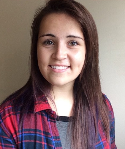
Hello, I'm Sarah!
Here to make awesome websites for you!

Hello! My name is Sarah and I’m a web developer from St. Catharines, Ontario. Graduating from the New Media Web Design program at Niagara College, I am well versed in multiple coding languages such as HTML, CSS, JS, and PHP as well as various aspects of design (ie. current trends, layouts, mobile first design…etc.). For the past 7 years, I have taken focus on developing custom WordPress themes for clients, integrating SEO practices into my development and creating user friendly interfaces. Through my time designing and working on projects I have learned how to be both an independent and collaborative worker in the field. My hope is that through my work I am able to transform a user’s idea into a well established web presence.
When I am not developing, you can find me playing video games, at the bowling alley, on the soccer field, or exploring the great outdoors with my trusted four legged companion. The odd time you might also find me capturing the beauty of nature through a lens or using my family and friends as models for my photography collection.
Holy Cross Catholic Secondary School
Honours
Niagara College of the Applied Arts
New Media and Web Design, Honours
Wilfred Laurier University
Honours, Criminology 101, Psych 101.A
Brock University
Sociology, Introduction to Computer Science, Python
Guest Service Associate
Customer Service Representative, Senior Representative, Ticket Sales, 4D motion Theatre Operator, Elevator Operator...
Web Designer and Developer
Website Design, Project Manager, Front and Back End Development, CMS Incorporation, Launch Website, Instruction Manual Creator
Junior Web Developer
Website Development, SEO Integration, Front and Back End Development, CMS Incorporation (WordPress), Launching Websites, Instruction Manual Creator
Web Developer
HTML,CSS,PHP,Javascript,custom WordPress theme building, Silverstripe CMS, GIT/Github, Scrum/Agile team work environment, building promotional banners, website updates, following AODA guidelines, SEO optimization, Docker usage, Tailwind CSS, Boostrap grid system
All project items marked with a GW were developed in association with the Graphix Works and remain property of the Graphix Works
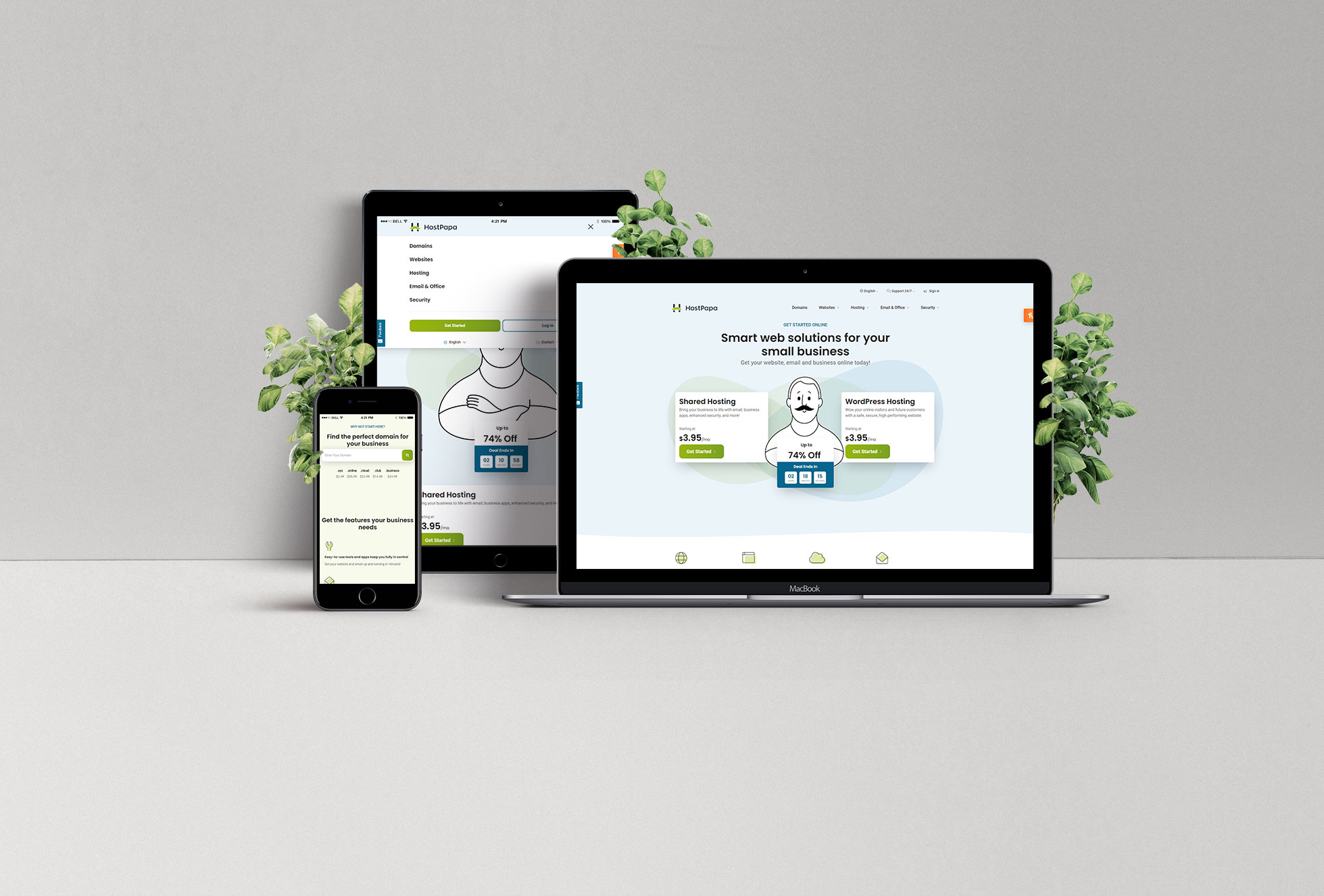
HostPapa is undergoing a rebranding of it's company. Following the design provided, developers took on the task on updating the existing site to be transferred over to a Headless CMS. The integration of custom StoryBlok bloks via Astro and Typescript was used heavily in the development of this site. The new design is currently up and running in both English and French for .CA at the moment.
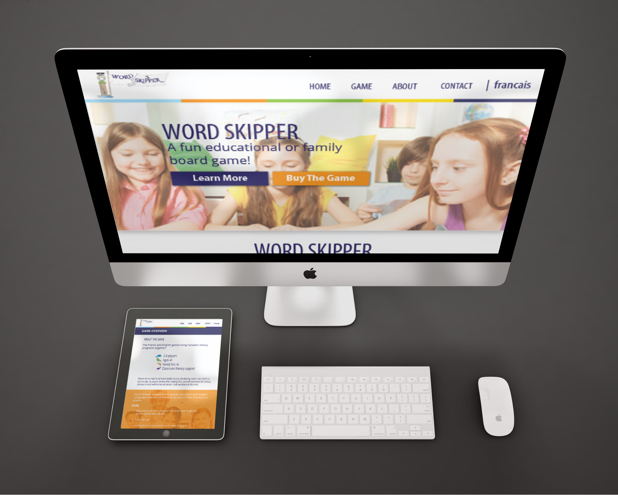
wordskipper.com was an information-based website. The goal of this site was to inform it's user's about the children's educational game Word Skipper. The purpose of the design was to convey an inviting theme to the target audience (both younger children and their parents). This site uses big call to action buttons to hopefully draw the user into buying the game online, from the company's site. This site also seems to be under construction a lot, so please enjoy the version on my server.
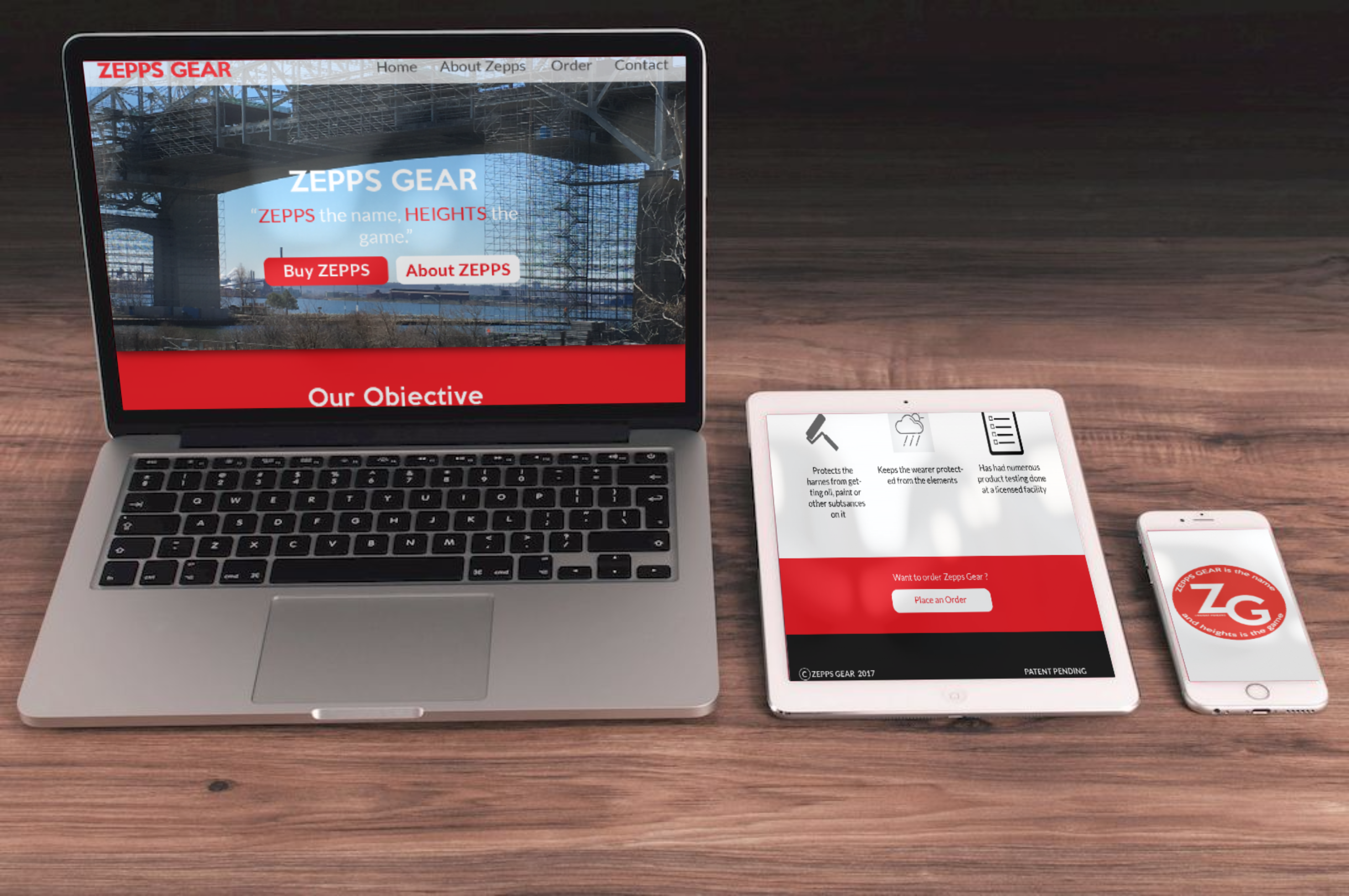
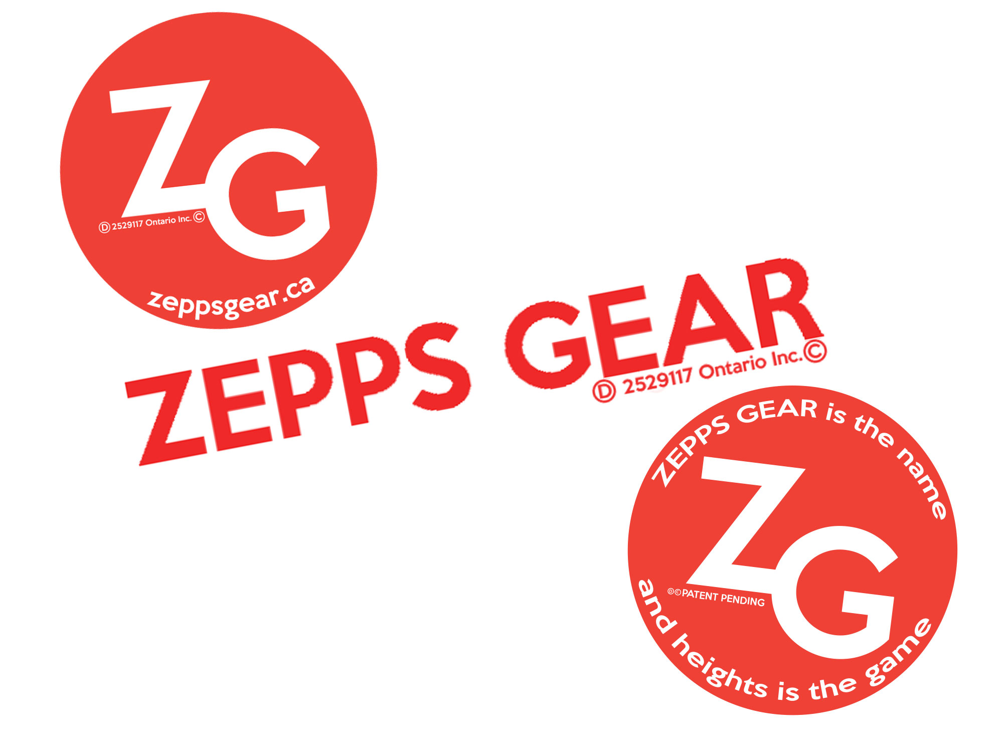
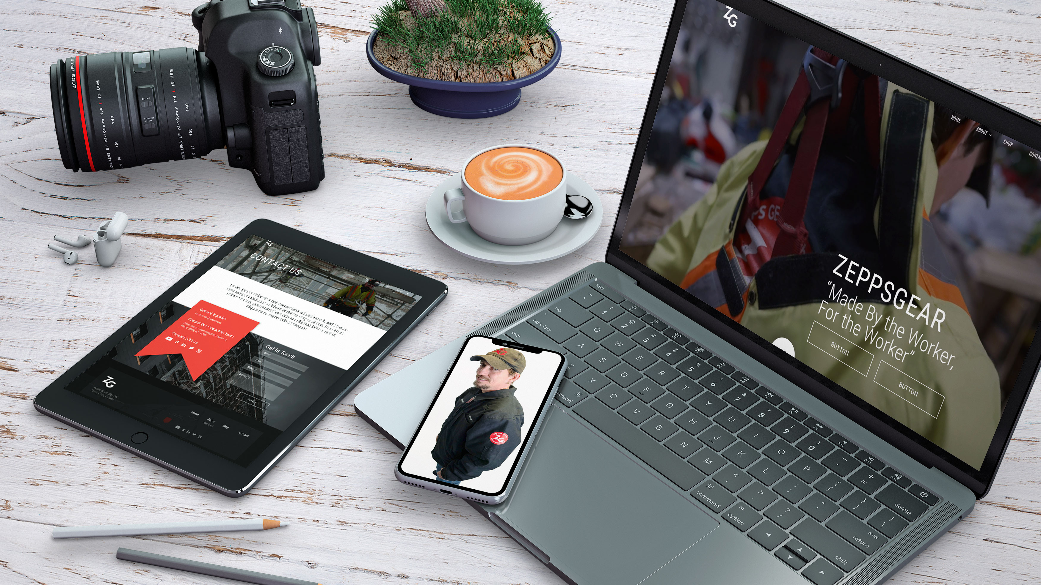
zeppsgear.ca recently underwent a major overhaul and became an eCommerce website to promote and make sales for various ZeppsGear products. This site allows users to purchase products online as well as find important information about the company. I also designed the logo for a sticker that the client is using to promote his product with.
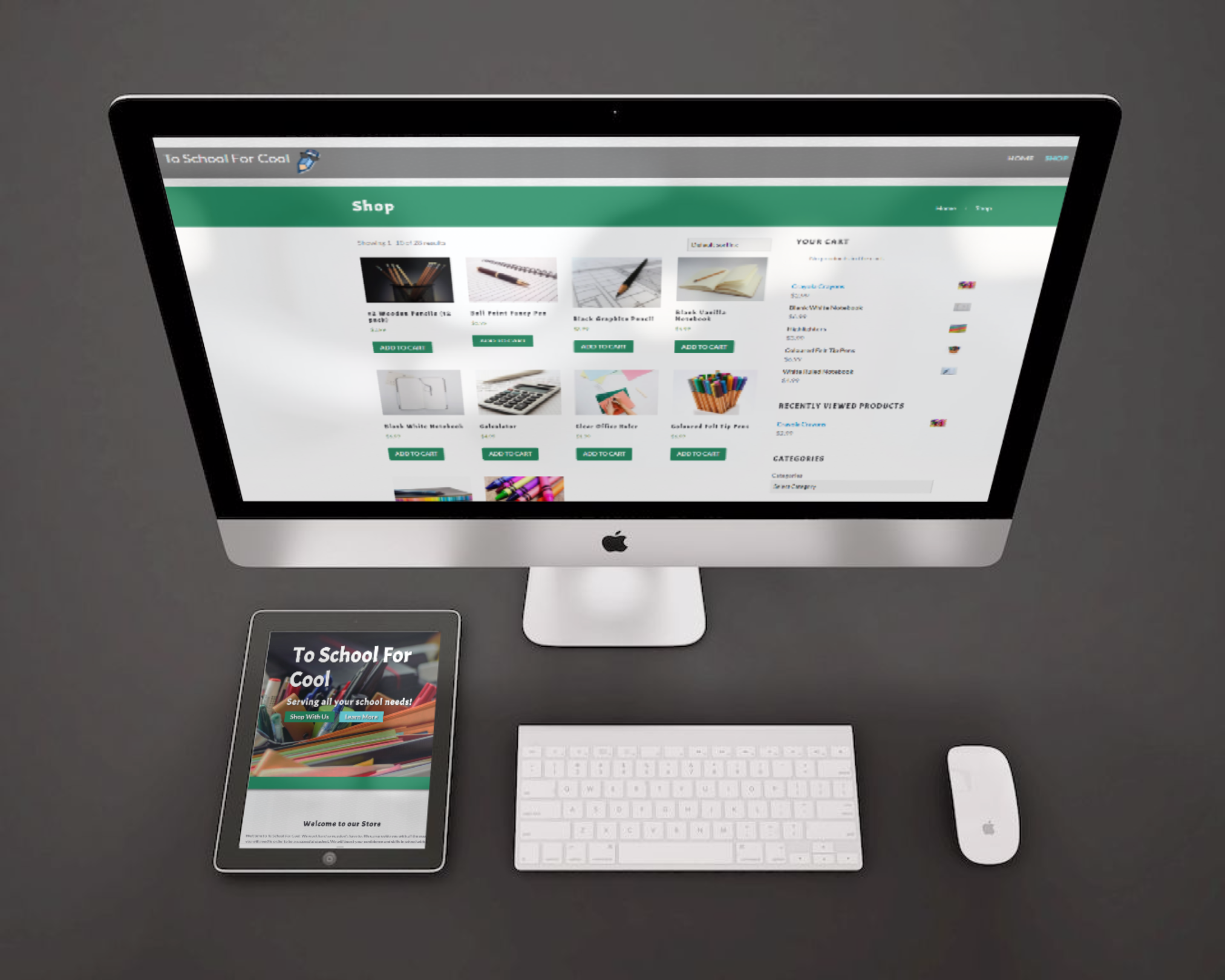
Too School For Cool was a project used to practice converting a child theme into a functional WordPress theme. On this site you can view items, add them to your cart, and place your order. None of the payments will go through without supervisor approval (which is myself) so of course, you will not receive any orders you place or get charge for them! Enjoy checking out this fantastic little mock up e-comm site.
This funny looking character was created using Adobe Illustrator. Many tools and components were used to make up this interesting popsicle character such as layers, gradients, the pen tool, layer masks.
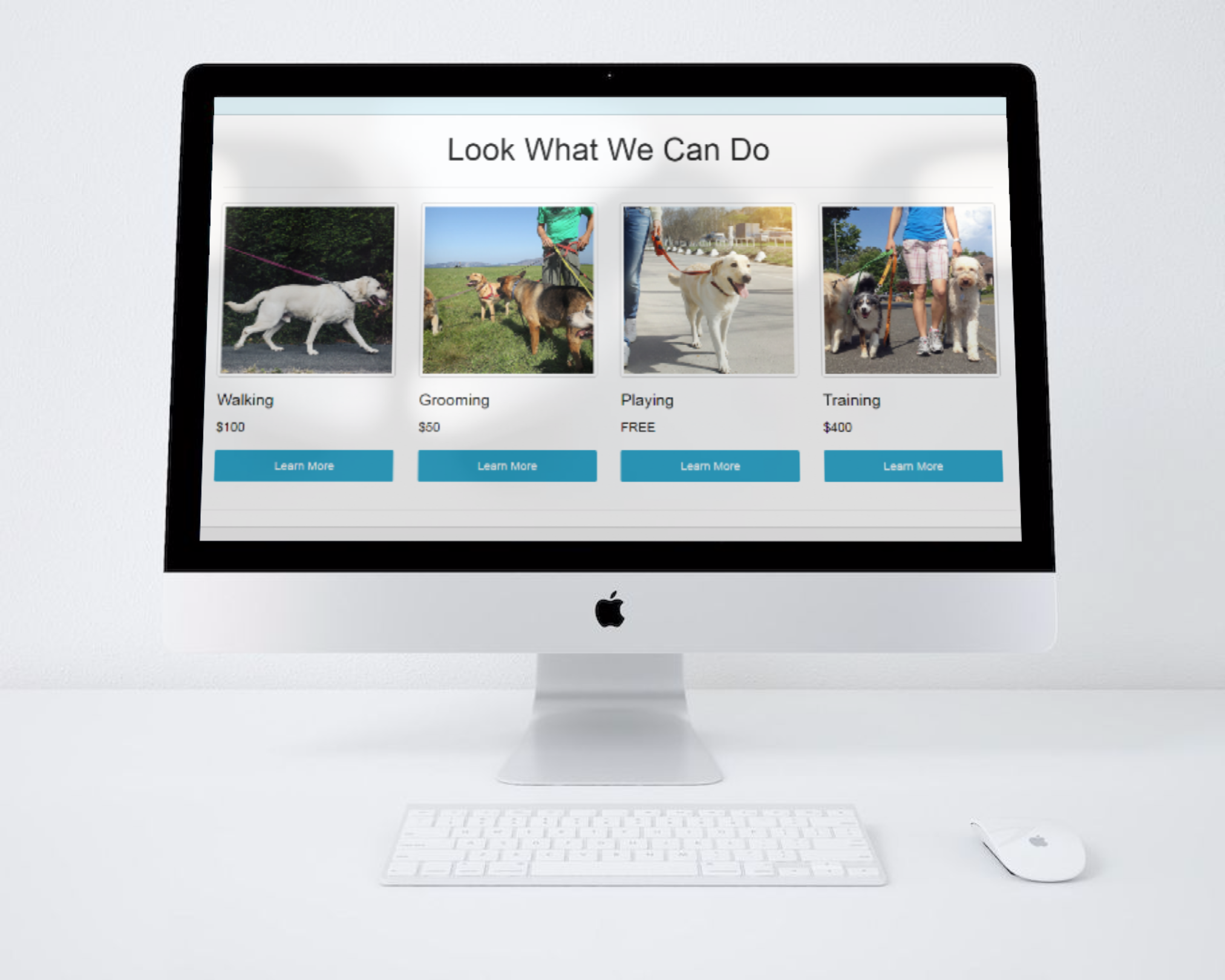
Dog Walkers R Us is a project used to practice converting a custom e-comm theme into a functional WordPress site. Although you can go further and view more information on the individual services, it is still just a mock-site and therefore you cannot actually make a purchase.
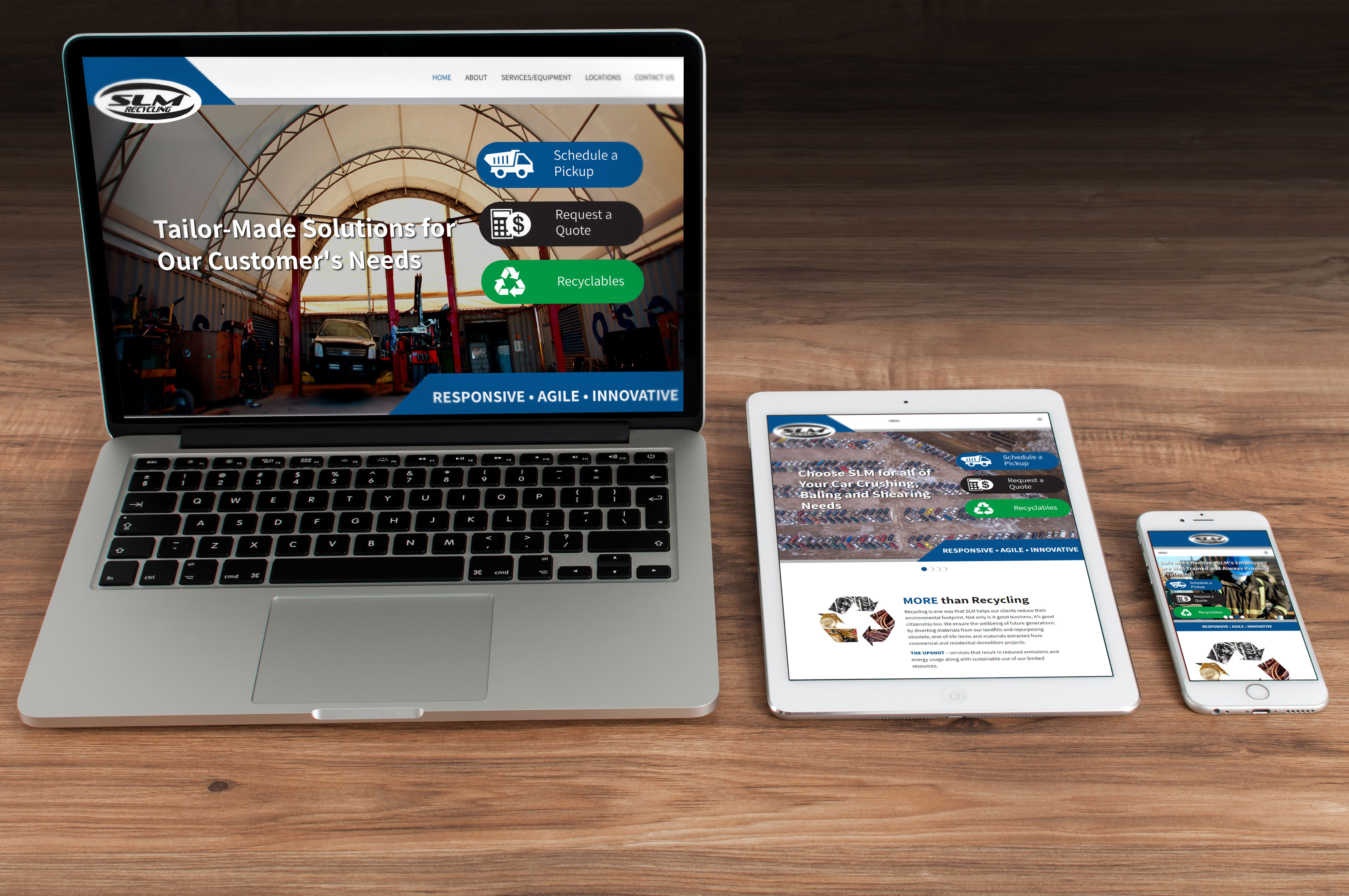
The website built for SLM Recycling has some unique features including an interactive image on the home page as well as a full screen video background on it's recyclables page. I developed this website using WordPress and took advantage of plugins such as Advanced Custom Fields and Gravity Forms in its development.
Using video clips provided by the client, I created a video demonstrating the pros of their product and how it compares to competing products out on the marketing. Video slicing, audio mixing, and other added effects were used.
GearCo Industrial was in need of some titles to be created for a few videos on their YouTube channel. I created title panels to appear at the beginning of each video that included the client's logo and contact information. The titles then fade out as the video begins. Below is an example of this:
Cake By Cheryl is a website built using WordPress that features extensive photo galleries that show off the clients products. Much of the whimsical pieces from the home page design are carried out through out the internal pages to create a constistent design throughout the pages of the website.

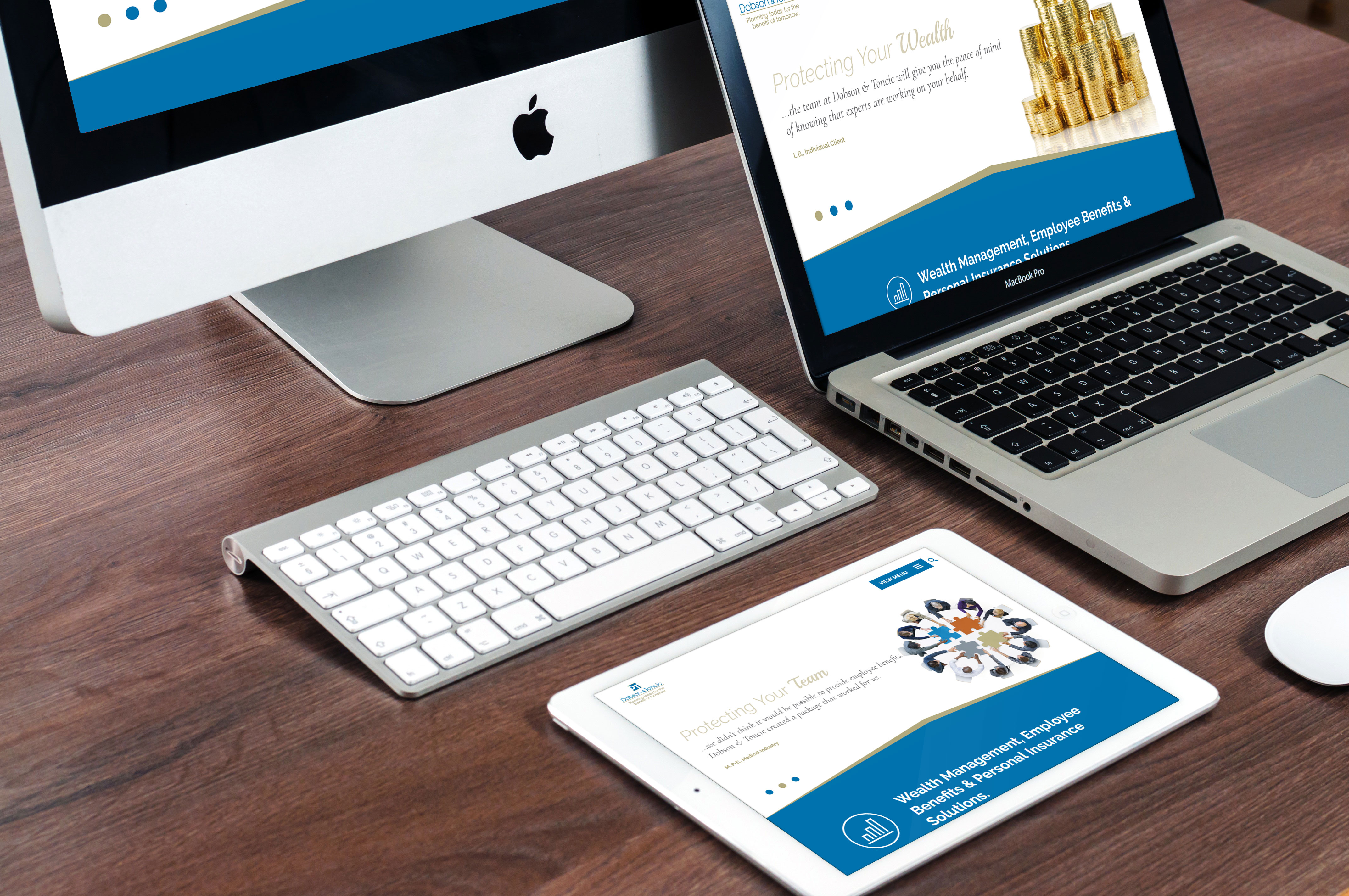
Dobson & Toncic was in need of an updated web presence for their company. By adding some different animations to the updated design, as well as accordions to feature the testimonials on the site, the overall user experience was enhanced.

The website built for aAvalon Eco Resort has some unique features like a weather widget on the homepage to give users real time weather forecasts as well as a blog area where recent blog posts are updated and featured on the home page. I developed this website using WordPress and took advantage of plugins such as Advanced Custom Fields and Gravity Forms in its development.


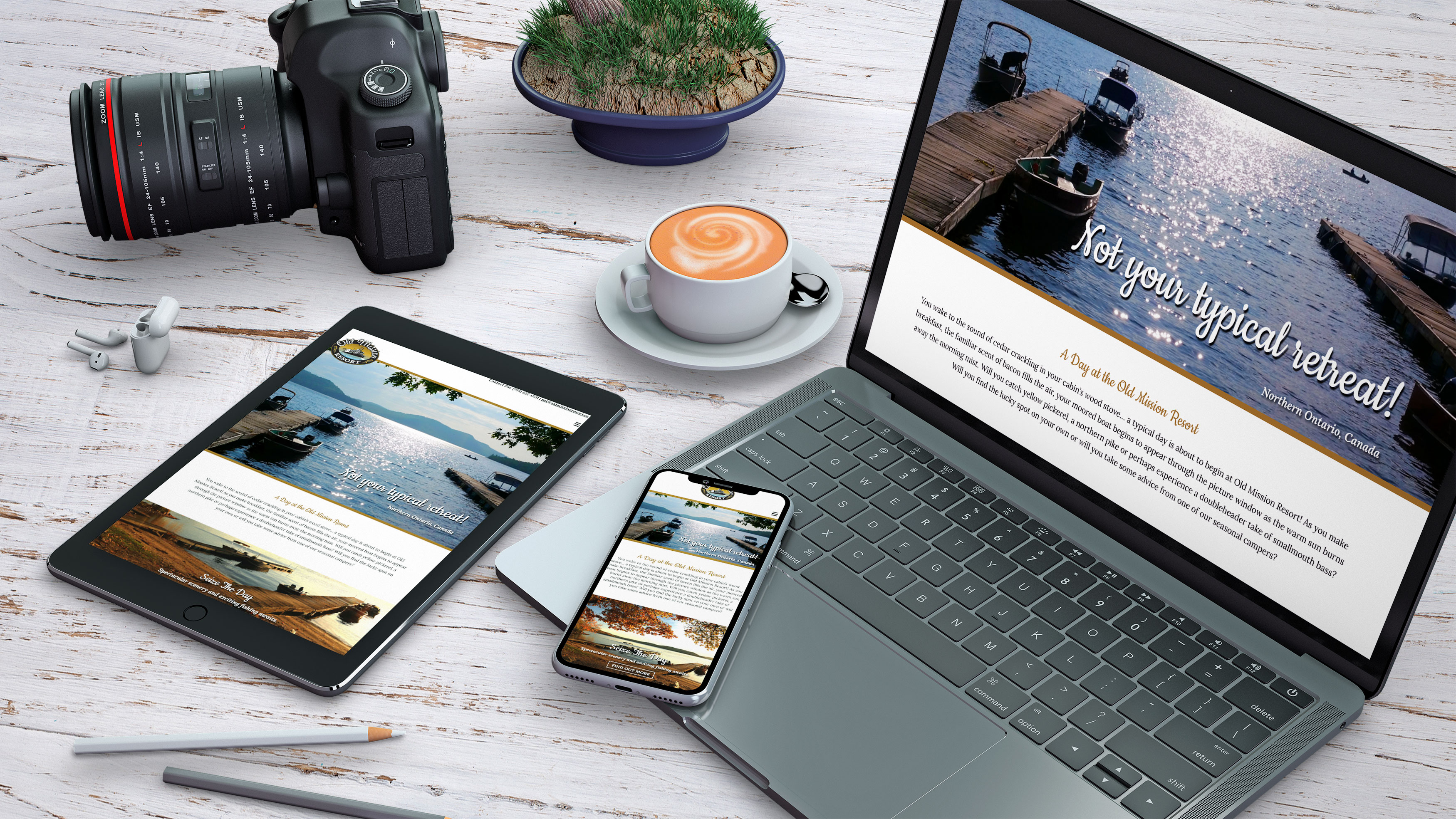
Old Mission Resort takes advantage of the scenery from where their camp is located and heavily uses images in it's design to divide content into separate sections. This website also benefits from the use of accordions used to organize areas like the photo galleries and tables used to organize rate information.

The client for Zepps Gear needed a logo created for their new company. The required different versions of their logo and name to be created for various items such as their website and for stickers.
My old portfolio design made use of a landing page to make it easier for users to navigate through the different sections of the website. Images and coloured sections of the website used clip-paths to create all sorts of abstract shapes throughout to create an interesting and unique look to keep users engaged as they navigated throughout the website.

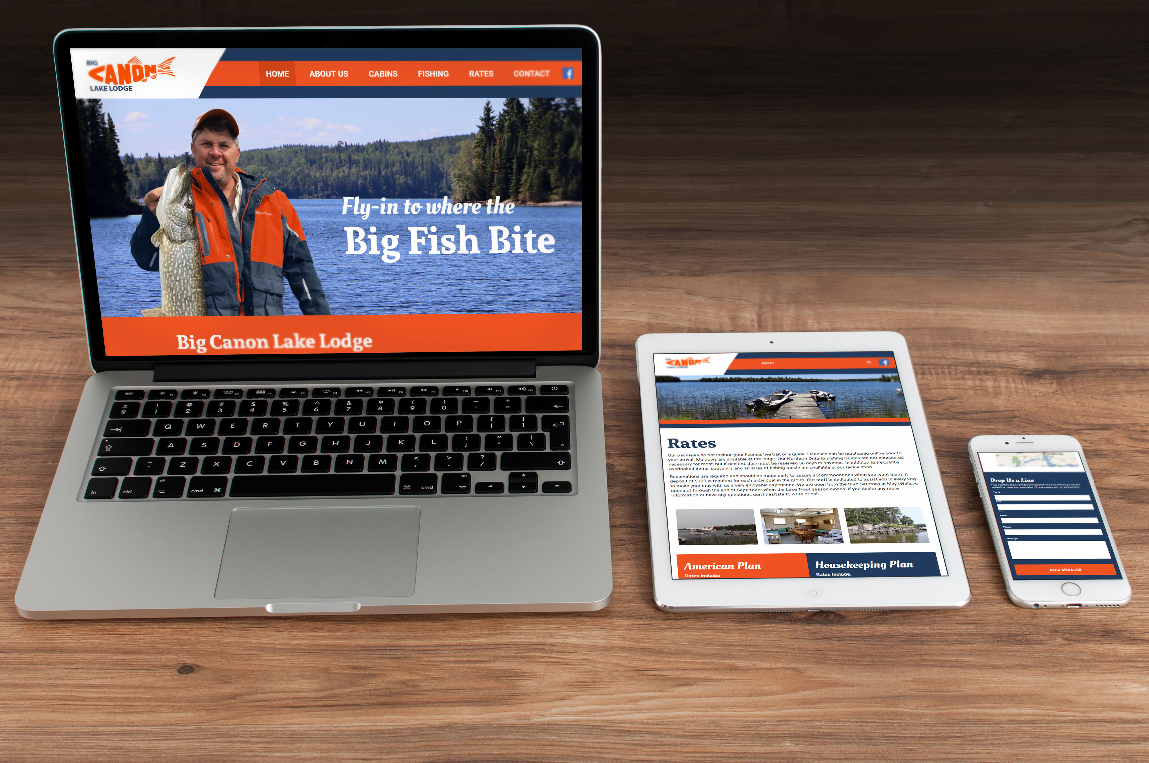
Big Canon Lake Lodge was in need of an updated web presence. Following the design provided by our designer, I added some additional animation effects and carried over some of the design concepts to the internal pages of the website. This website was created with the use of WordPress and the integration of Advanced Custom Fields and Gravity Forms in it's development.
The current Zepps Gear website is dated and in need of a facelift. In order to bring the website up to speed with current trends, there is a website overhaul in progress. The design portion is complete and better represents to current Zepps Gear company. With the use of attractive imagery and a professional colour palette, Zepps Gear's new design will be more attractive to potentional buyers on their upcoming e-commmerce site.
Using video clips provided by the college, I (along with my classmates) created a video to promote the 50th Anniversary of the college during the Holiday season. Video slicing, audio mixing, and other added effects were used.
Web Designer & Developer